
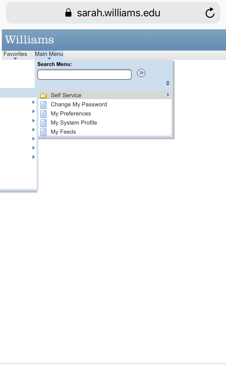
I chose PeopleSoft because it’s been a struggle to use all around. It is certainly difficult to use on the computer, but it is even worse on phone. I remember trying to book a bus ticket back home on PeopleSoft on my phone but couldn’t at all because the navigation bar doesn’t even show on the screen when you tap on the main menu – it just gets cut off entirely (second picture). Another frustrating part is the initial confusion of logging in and seeing the huge expanse of blank space (first picture) with the navigation bar barely visible on the top, and then realizing you need to zoom into it.
Students do most of their important registrations through this design, such as registering for bus tickets and classes for the next semester. Registering for tickets is especially stressful because people rely heavily on the bus services provided by the school to get to and from the airport (there are many stories where students faced flight delays and as a result lose their bus from Albany to Williams). Students also use PeopleSoft to check their semester grades which is an anxious experience for many. The difficulties navigating this design doesn’t comfort the user. If anything, it’ll stress the users out even more as they try to get to a certain page.
The design is already hard to use on the computer, and it gets worse on phones and tablets. My biggest struggles have been using it on the phone so I will elaborate on its design via the phone – the display is very small and unless you zoom in excessively, anywhere you tap on the phone screen can be misconstrued for tapping another tab on the navigation bar, leading you to a page you’re not interested in being. Additionally, the design doesn’t seem to be built for the phone because it gets cut off at certain parts of using it and requires you to flip the orientation of your phone screen sideways so you can view the part of the design that got cut off. While the design seems very flawed, I still appreciate how Williams gathered all of these resources into a single place that makes it easier to access everything at once. There is, however, still a lot of changes that need to be made.