Looking Back: A Reflection of Both Myself and RES
RES started off as an application used to aid in the college housing system. Initially named RES, short for “residential,” the name evolved into an acronym for “Residential Event System.” The entire process of designing and researching for the application was a roller-coaster of trying different ideas, watching them fail, learning from the ineffective designs, and redesigning them to succeed. The entire experience was an exciting mixture of successes and questions that brought RES to the point it is at today. Let me share what I learned with you during each step of the design process.
Don’t Go Directly to the Solution
First of all, think slowly and thoroughly during the early process, especially the group project proposal. It is easy to identify an issue and begin searching for solutions. My group in particular was especially wedded to the idea of identifying as many problems and trying to address all of them. We had various groups(administration, students, and real estate agents) we wanted to conduct contextual inquiries on without considering the limited time we had to work on them. To conclude, we were overly ambitious. Doing so trapped us, the designers, into a narrow-minded problem-solution mindset that prevented further brainstorming for problems. Being too swift with figuring out solutions may distract you from conceiving worthwhile problems your group may want to tackle.
Thankfully, we honed our focus on just students, and our contextual inquiry actually diversified what we were looking for. Talking to interviewees raised concerns we never considered. It is easy as designers to generalize the problems of your users, and it was not until we started speaking to them that we realized there were other specific and important issues us as designers could not have thought of unless we were in their shoes, which is what the contextual inquiry process is for. Talk to your users, ask questions, be receptive to their comments, and most importantly, be holistic in your approach. It is convenient to ask basic questions you already know the answers to. Instead, build off their comments and ask about gaps in their stories. This is where we learned the most about our users.
Building off of the contextual inquiries, what helped cohere our project was the affinity diagram. Affinity diagramming was especially useful because it helped us compile the information we received from the contextual inquiries and categorize them into themes such as “too many people” or “problems communicating with administration.” The diagram looked like this:
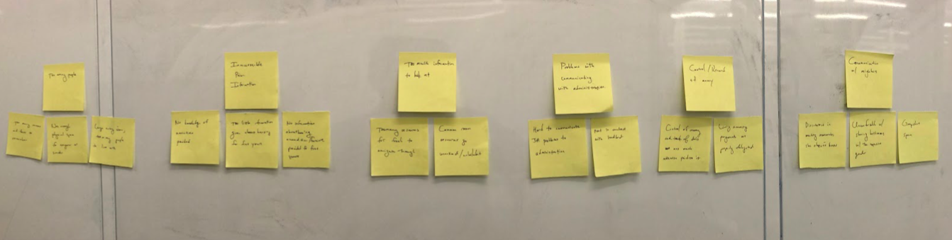
What helped our group look at the contextual inquiries in a broader context was by avoiding words we previously used to describe housing situations we thought about and wanted to address during the affinity diagramming. Doing so gave us a new way of interpreting the themes so that they do not segway back into old thoughts about problems, offering us a refreshing perspective. This renewed perspective aided us in deciding on directions we wanted our application to head in our task review. The affinity diagram and further introspection within our group led us to consider what tasks we wanted to include in our low-fidelity prototype. Looking back, it would be interesting to redo the affinity diagramming. Equipped with more experience and knowledge from the class, it would be exciting to see how different and possibly more comprehensive our affinity diagramming would look.
What Could Have Been Done Differently?
Looking back with more knowledge and experience about the design process, I wonder what other modalities similar to contextual inquiry we could have used that may be more effective during this specific aspect of the design process. I found it difficult to conduct a contextual inquiry in our context because we needed to observe and ask questions to the user as they are working in their environment. At times, it felt like we forced our project into the mold of contextual inquiry. This involved watching the interviewee go through their housing-related chats and emails so we have points of conversation and questions that can arouse. However, this felt less natural than the mentor-mentee relationship mentioned in the readings. If I were to redo this design process, I would consider other methods of inquiry besides contextual inquiry. Contextual inquiry certainly worked, but other types of inquiry may be more applicable for our scenario and we may also generate other information that can change the trajectory of our project. This is the best part about the design process: you’re constantly learning. When you look back at work that was already done, you should be questioning whether your decisions were the wisest. You gained new experiences and learned lessons along the way. You should be questioning your past decisions.
Prototyping: It’s Not as Easy as You Think it is
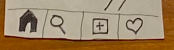
When it came to creating paper prototypes, our group tapped into the ways of designing information and how it is interacted with through our information prototype readings. We implemented task flows so there is a logical transition from each screen to the next and took inspiration from the hub & spoke of information architecture to design our application’s navigation system. The hub & spoke system specifically refers to the icons on the bottom of our screens that lets users do certain activities and return to the “hub” by tapping on the home screen. The icons looked like this:
I remember finishing the paper prototype with my group and feeling an immense sense of satisfaction believing the prototype cannot get any better. This changed when we conducted heuristic evaluations.
Personally, I found the heuristic evaluations the most valuable and necessary. We, the designers, were very content with our product because we were the ones who created it and therefore have a mental layout of what the prototype SHOULD be like. What we were missing was the user’s experience, and what the prototype ACTUALLY was like. The users did not know the prototype as well as we did and therefore discovered issues while testing it out that we glossed over while designing. We discovered a lot of mistakes and aspects of our prototype that we wanted to change through this process. One of our mistakes was not having the “back” feature which inhibited the user experience. My biggest takeaway from this aspect of the design process is the importance of communication: what you imagine may not always translate directly to reality and the product itself. It is difficult to create a perfect prototype in the first version. Be on the lookout for errors and be open to suggestions from your peers! They are the “users” who are not familiar with the inner-workings of the prototype. Despite the heuristic evaluation, we later encountered more errors in our prototype during the usability testing phase. Although we took Norman’s advice of prefacing the paper prototype by explaining the purpose of it, users still had difficulty deciphering the meaning of our icons.
Accessibility
The digital mockup process was my favorite and I voluntary did most of it with the approval of my group. It was exciting looking through the heuristic evaluations and comments we received from the usability test and putting them into a digital prototype. While digitizing our design, I frequently considered how I can make the design more accessible for users. It was difficult trying to make the application more accessible because there are many forms of accessibility that I read about and I likely did not have enough time to make it accessible for everyone, but I still made an effort while digitizing. Interestingly, some parts of the application that I would implement for one group of people may actually be a detriment to another such as the differing color contrast-preferences between users with autism and users with low vision and/or dyslexia. One big change I made from the usability testing was the labeling of icons in the bottom of our screens, changing it from this:
To this:
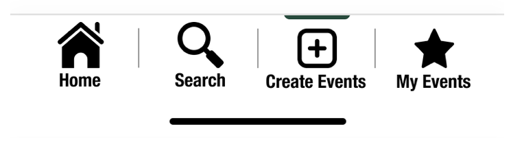
We did this because the users we tested our prototype on already had difficulty understanding the icons. When thinking of people with vision-impairments, the icons may be further indistinguishable and not understandable, another reason for labeling the icons. When trying to make the application easier to look through information, we followed a linear logical layout in most of our screens which makes it easier to view. Without realizing, we actually made the application more usable for people with autism, low vision, dyslexia, anxiety, and/or users of screen readers. This brought me back to a point reiterated multiple times in class about how by designing for people with special needs, you may indirectly be helping the general user, as well. The example that first comes to mind would be curb ramps, which was initially created for wheelchair users but ultimately aided everyone in their commute. In the future, if I were to add onto this project, I want to include a “dark mode” which allows users with dyslexia to adjust the contrast of the background and text and add alt text for screen readers.
For approaching accessibility in design, specifically augmented reality, I would want to focus on people with anxiety that may feel discomfort from overstimulation from the experience, people with difficulty hearing who may be understimulated, and people in the autistic spectrum who may be overstimulated by colors and information, just to name a few. Our design for the augmented reality may not be intentionally exclusive, but it could be exclusive by design, and the groups I mentioned before are the ones I think may immediately be affected by poor design.
A few points of accessibility I would like to approach at first glance would be to conduct contextual inquiries on people from these groups. It is easier to identify the problems and address them for these groups but it will likely be less effective than to actually interact with them and understand the problems. After all, I myself am able-bodied and am not familiar with the experiences these groups have because I have lived in their shoes. In this case, I want to learn about their experiences and conduct the design process off of that instead of what I speculate would be problems.
Personal Code of Ethics
Lastly, for my personal code of ethics, my biggest two are confidentiality and transparency. I felt a connection to Facebook’s scandal with confidentiality when they sexually outed their users to their family. Being a gay person myself, I meticulously make sure the LGBTQ+ Facebook pages I like are never shown on my profile in fear that family may notice. It is particularly jarring to think that if I liked those pages ten years ago, my family may have found out because of Facebook’s negligence for the issue of disclosing user group joining at the time. I believe confidentiality is important, and it is one of my top priorities to make sure my users know how their information and activities are secure from people they do not want to disclose them to. Additionally, I was surprised by the OkCupid article and it further reaffirmed why I value transparency. Essentially, OkCupid manipulated their users’ dating pool by showing them other users that are labelled as “people you would be compatible with” and “people you would not be compatible with.” I learned the importance of confidentiality and transparency from these two readings because I learned about the consequences of when the two are violated which further contributes to why I wish to defend the two.
Conclusion
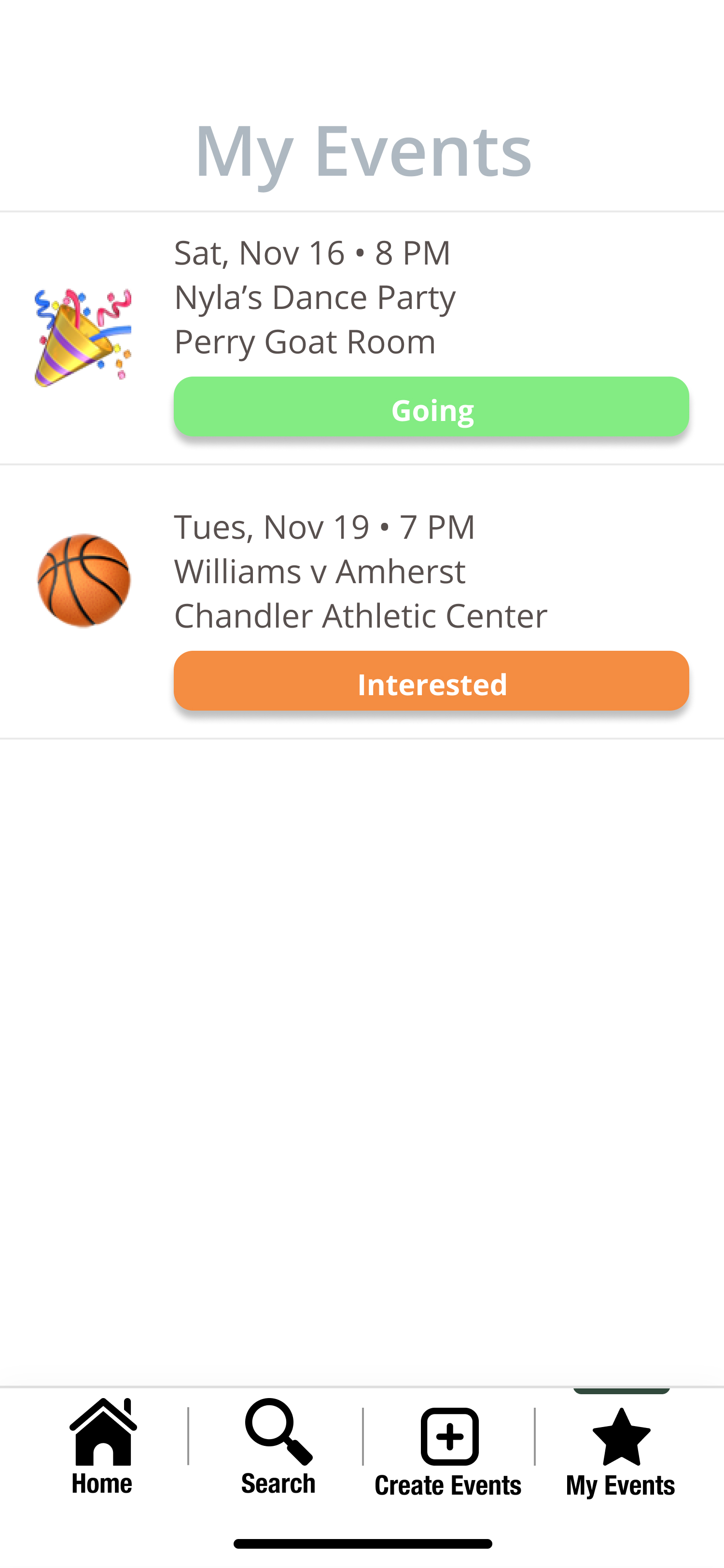
Overall, the design process was an eye-opening experience. I found the nuances of design very rewarding and it has made me more aware of design throughout my daily life, such as with the applications I use on my phone. It is also satisfying to look back at how much our project has changed. Comparing our paper prototype to the digital, the two look completely different, not just because the digital looks a lot cleaner but also because so many aspects of our tasks have been looked over and revised throughout the design process. Here is a screen from our paper prototype:
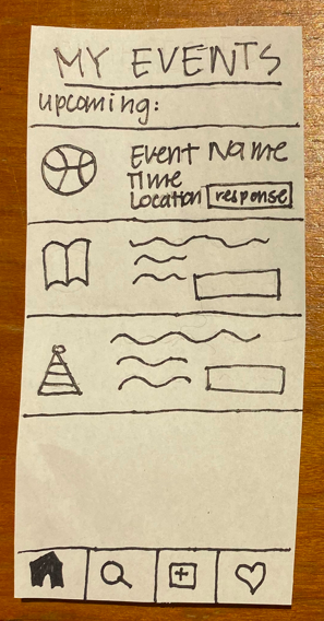
And here is the same screen from our digital mockup:
Thinking back, I would not have expected RES to have made so many changes in its direction, but they were all done with reason and in response to information we received during the design process. With the course wrapping up, I am glad to say that I am proud of the hard work my group has done and I am excited to carry the lessons and skills I learned with me to whatever work I do.