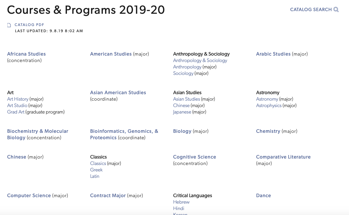
For the most part I never had an issue looking through the list of courses provided by the school. I chose this design because it not only gave me any problems, but it was also easily navigable. The courses are organized in alphabetical order and well-spaced from each other so it is easy to read. Organizing courses into semesters is also useful for students looking to take courses in that particular semester. The website itself makes me feel good because it is well-organized and well-spaced which lets me focus on the courses rather than a messy, hard to navigate design.
People who use this design are students who need to register for classes. At a liberal arts college that promotes academic exploration it is helpful to have all majors and concentrations displayed. Courses are organized into spring and fall semesters which makes it easy to look through because students look for courses in those semesters. Students look through the course catalog for the semester other than the one they’re in (students look at the fall courses during the spring semester and vice versa).
One critique I would have for this design is its inclusion of miscellaneous sections not related to courses and majors like study-away programs, specifically Williams-Mystic and the Williams-Exeter Programme at Oxford. While both are related to academics and courses, they’re not relevant to many students and only a small percentage of Williams students are part of these two programs.